Designing a New Legacy: Inside the Inaugural Rugby Awards Identity
A new awards platform needed more than a logo. It needed a living identity, built to move across screens, stages, and stories and strong enough to unite English rugby’s biggest institutions in one moment.
A landmark event deserves a landmark brand
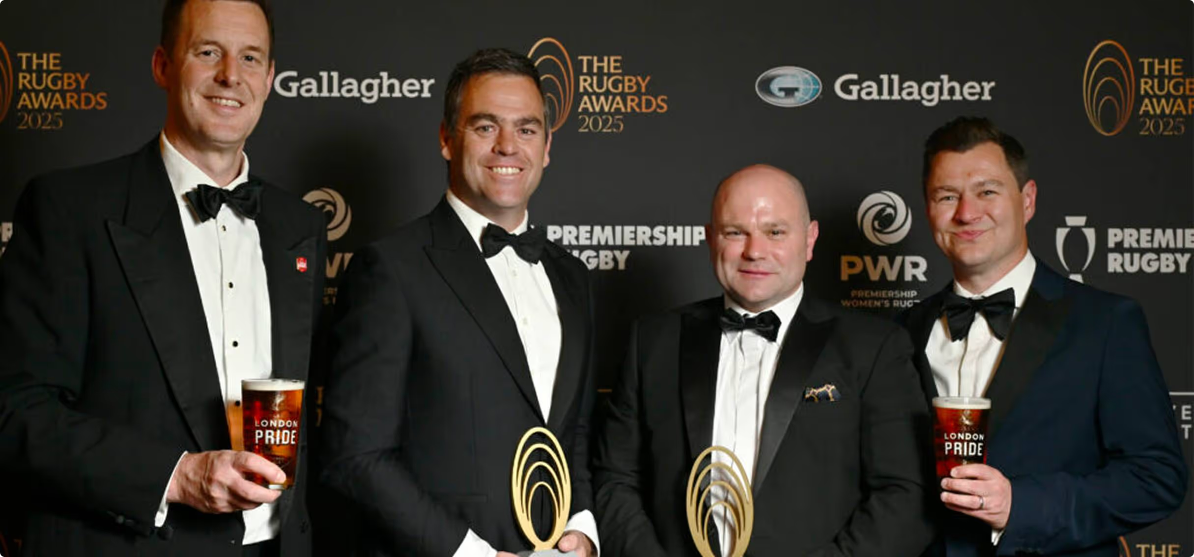
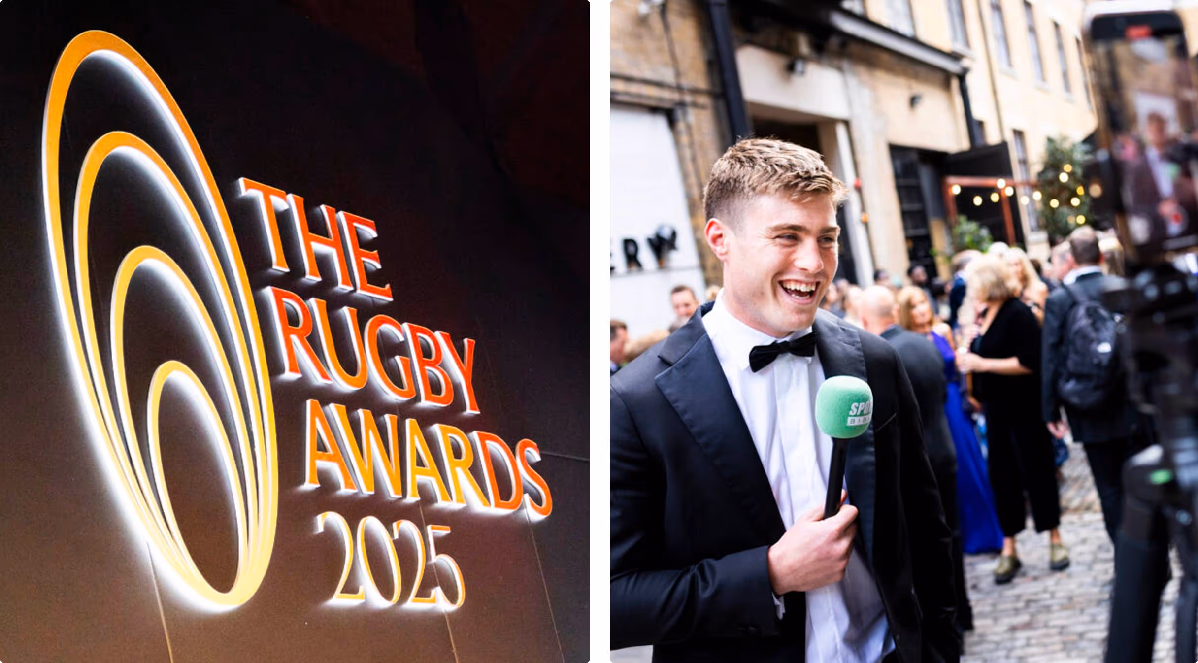
2025 marked the debut of The Rugby Awards, a new moment in the calendar that brings together Premiership Rugby, the RPA, the RFU, and PWR to celebrate the people and plays shaping English rugby.
When four bodies come together, the job isn’t just to “make it look good”. It’s to create a shared language. One that respects tradition, feels current, and scales across every touchpoint.
That was the brief. So that’s what we built.
Start with roots. Then build something new.
We began where strong identities begin: with meaning.
We dug into rugby’s cultural foundations - its codes, symbols, rituals and emotional highs. Then we studied the world’s most iconic awards shows, not to borrow their aesthetics, but to understand their mechanics: how anticipation is built, how winners are framed, how a room feels like a moment.
The goal wasn’t to imitate. It was to translate rugby into celebration.
Build a visual language with energy, emotion, and edge
Rugby is physical. Fast. Geometric. Unpredictable. So, the identity needed to move like the game.
We shaped a visual system designed for impact:
- Bold colour choices informed by iconic moments from the season
- Graphic movement + form inspired by the flow and collisions of play
- Strong, confident typography that holds its own on stage and on screen
The result: a brand that’s unapologetically rugby, while still feeling like an awards platform with real stature.
Design for the real world: screen, stage, and in-hand
Awards identities don’t live in one place. They travel.
This one had to work everywhere: mobile graphics, social assets, printed programmes, venue dressing, and large-scale event visuals. That meant designing a system that could flex without breaking, consistent enough to feel coherent, but adaptable enough to meet each format on its own terms.
We pressure-tested every application for:
- Clarity at speed
- Consistency at scale
- Impact from any distance
And we made sure the identity didn’t just “fit” the event. It elevated it.
Collaboration isn’t a phase. It’s the craft.
Work like this only lands when partnership is real.
We worked closely with the Premiership Rugby team throughout, aligning on standards, sharpening details, and building confidence across every output.Because the best creative isn’t delivered to a team. It’s built with them.
That’s collective thinking in action: diverse specialists, shared ownership, one outcome.
More than an identity. A moment that connects a community.
In the end, the identity did what it needed to do.
It created a shared stage for Premiership Rugby, the RPA, the RFU, andPWR, amplifying players, coaches, and clubs, and giving the sport a new kind of spotlight.
And when we saw it live, on stage, in the room, in the atmosphere, it confirmed the real measure of design: not how it looks in a deck, but how it feels in the world.
At Brand Potential, we build brands that flex across culture + commerce, fusing deep craft with diverse perspectives and machine intelligence to turn moments into momentum. We are Brand Potential. Partners in Possibility.