Building an iconic brand. PREM Rugby's transformation and future growth
The transformation of Premiership Rugby into PREM Rugby was never intended to be simply a new identity, a new logo or a shortened name. Instead, it represented one of the most ambitious brand transformations in British sport, redefining what the organisation is, who it serves and, perhaps most importantly, how people should feel when they experience it.
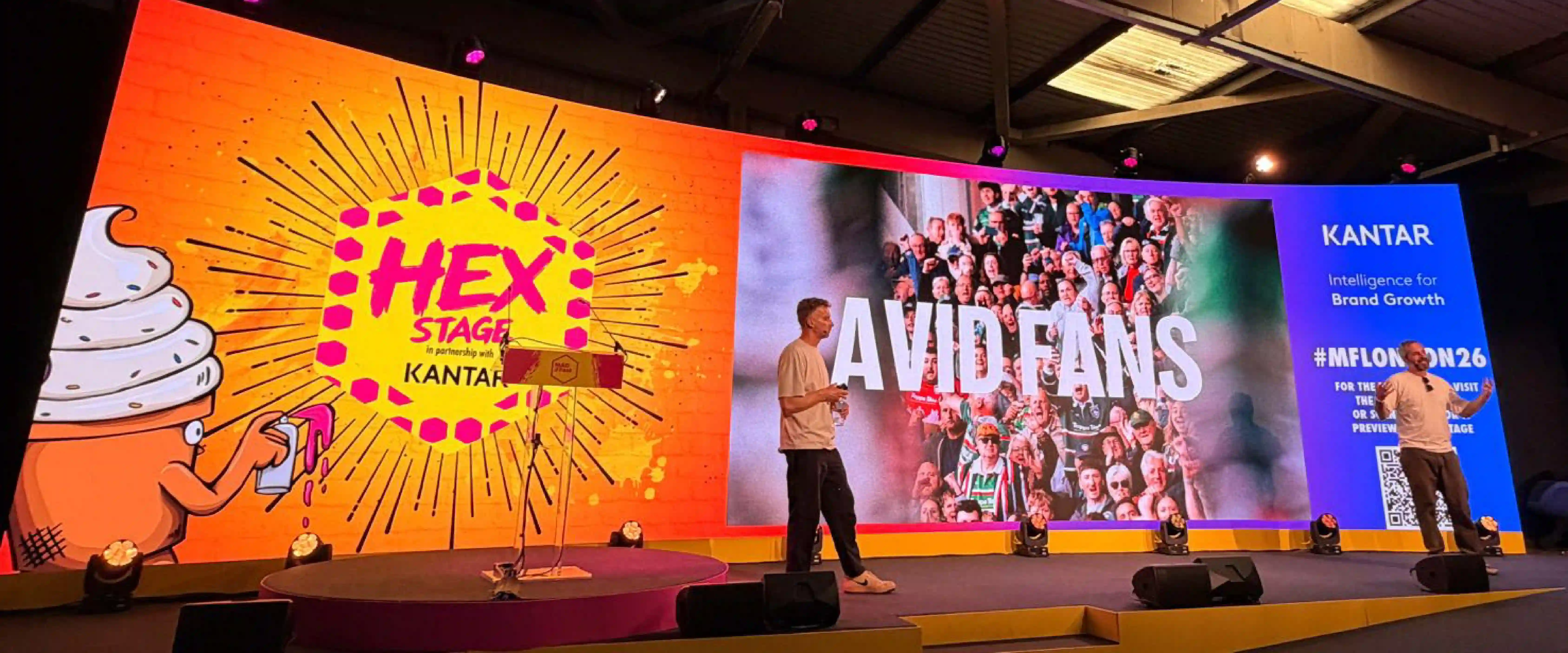
At its core, the project was less about branding than about strategy, culture and entertainment. It was built on the belief that modern sports organisations no longer compete solely with other sports.
They compete for people's attention.
Before any creative work began, the team established a simple philosophy that became the foundation for every decision. Great brands, they believed, should do three things.
They should be truthful, truthful to the organisation, the people behind it, the supporters and the experience people actually have.
They should be memorable, not because they are louder than everyone else, but because they create emotional memories that people instantly recognise.
And they should be noticeable, creating conversations, building fame and becoming something people actively want to talk about.
Those three principles, truthful, memorable and noticeable, became the lens through which the entireproject was evaluated.
The transformation began with a simple question.
What if?
What if Premiership Rugby wasn't simply a sports competition?
What if it behaved like Netflix?
What if it behaved like a music festival?
What if it launched new seasons the way technology companies launch products?
What if it became an entertainment platform instead of simply a governing body?
Rather than looking across the sports industry for answers, the team deliberately looked beyond it, examining how entertainment brands, broadcasters, festivals and technology companies build anticipation, engage audiences and create cultural moments.
That shift in thinking led to a simple conclusion.
Premiership Rugby was already entertainment.
Every weekend featured elite athletes, compelling personalities, rivalry, conflict, drama, heartbreak, heroes and dramatic finishes.
Everything needed to create compelling entertainment already existed.
The challenge was not changing rugby.
The challenge was changing how rugby presented itself.
That strategic shift was also driven by a commercial ambition.
The league wanted to grow its audience from approximately 1.8 million people to 3.8 million.
Achieving that meant attracting entirely new audiences without losing the supporters who already loved the game.
The objective was not to replace existing fans.
It was to expand the audience by making rugby more accessible, more emotional and more culturally relevant.
That became the defining challenge.
Building the brand
The answer emerged through a remarkably simple strategic position.
Rugby is ferocious.
And it is played on the edge.
Those ideas became much more than campaign slogans.
They became the organising system for the entire brand.
"Ferocious" reflected the physical reality of elite rugby, the collisions, commitment, intensity andsheer scale of the athletes.
Rather than softening those characteristics, the new brand embraced them.
"Played on the edge" described something different.
The emotional uncertainty.
Matches decided in the final seconds.
The tension.
The unpredictability.
The feeling of sitting on the edge of your seat because nobody knows how thegame will end.
Together, those ideas influenced every aspect of the brand.
Broadcast.
Digital.
Content.
Photography.
Partnerships.
Motion.
Language.
Every decision was designed to reinforce the same emotional experience.
The creative challenge became translating emotion into design.
If rugby feels like adrenaline, what does adrenaline actually look like?
What does anticipation sound like?
What does pressure feel like visually?
The design process explored fractured textures, movement, impact and raw energy.
Rather than polished corporate graphics, the visual language became physical, human and visceral.
One of the most significant creative ideas came from studying movement across the rugby pitch.
Patterns of play.
Player positioning.
Moments of impact.
Crowd emotion.
Those observations inspired an evolving graphic language resembling a heat map of energy moving across the field.
The result was not simply a pattern.
It became a living design system capable of adapting across every application while consistently expressing the same emotional qualities.
The team also explored sound.
Entertainment brands do not only look different.
They sound different.
What should supporters hear as they enter a stadium?
What should a television broadcast feel like before kick-off?
Music became another storytelling tool.
Slow builds.
Heavy percussion.
Powerful horns.
Pressure.
Pause.
Impact.
Release.
The emotional rhythm of a rugby match was translated into sound.
The identity itself also evolved.
One of the boldest decisions was dropping seven letters.
Premiership Rugby became PREMRugby.
The change reflected the language supporters were already using.
Typography became stronger, larger and more confident.
Combined with adaptable colours, textures and graphic elements, the result was a flexible identity capable of working across clubs, sponsors, digital platforms, stadiums and broadcast.
But the project was never intended to remain inside a presentation deck.
It had to live in the real world.
The launch introduced not only anew identity but a new attitude.
The storytelling shifted away from institutions and towards individuals.
Players became the heroes.
Photography became more emotional.
Language became more direct.
Every element worked together to communicate that something had fundamentally changed.
Results and the future
One of the most significant milestones came when partners began adopting the new identity themselves.
TNT Sports integrated the PREMRugby design system throughout its television coverage, creating consistency across broadcasts, highlights and promotional programming.
Whether supporters were watching live matches or television promotions, they encountered the same visuallanguage.
Repeated exposure builds familiarity.
Familiarity builds memory.
Memory builds brands.
The league also completely rethought its content strategy.
Previously, communication centred largely on fixtures and results.
The new question became: What happens between the matches?
Instead of communicating only on weekends, the league began creating reasons for audiences to engage every day.
Content explored what players eat.
How they train.
Their routines.
Their friendships.
Their personalities.
Their cars.
Their humour.
Their lives away from rugby.
Some content was serious.
Some was playful.
The objective was never simply information.
It was connection.
Supporters increasingly follow people before they follow organisations.
The goal became creating rugby superstars that audiences genuinely wanted to follow throughout the week.
In many respects, the league stopped behaving like a governing body and began behaving like a media company.
According to the league, the results have been significant.
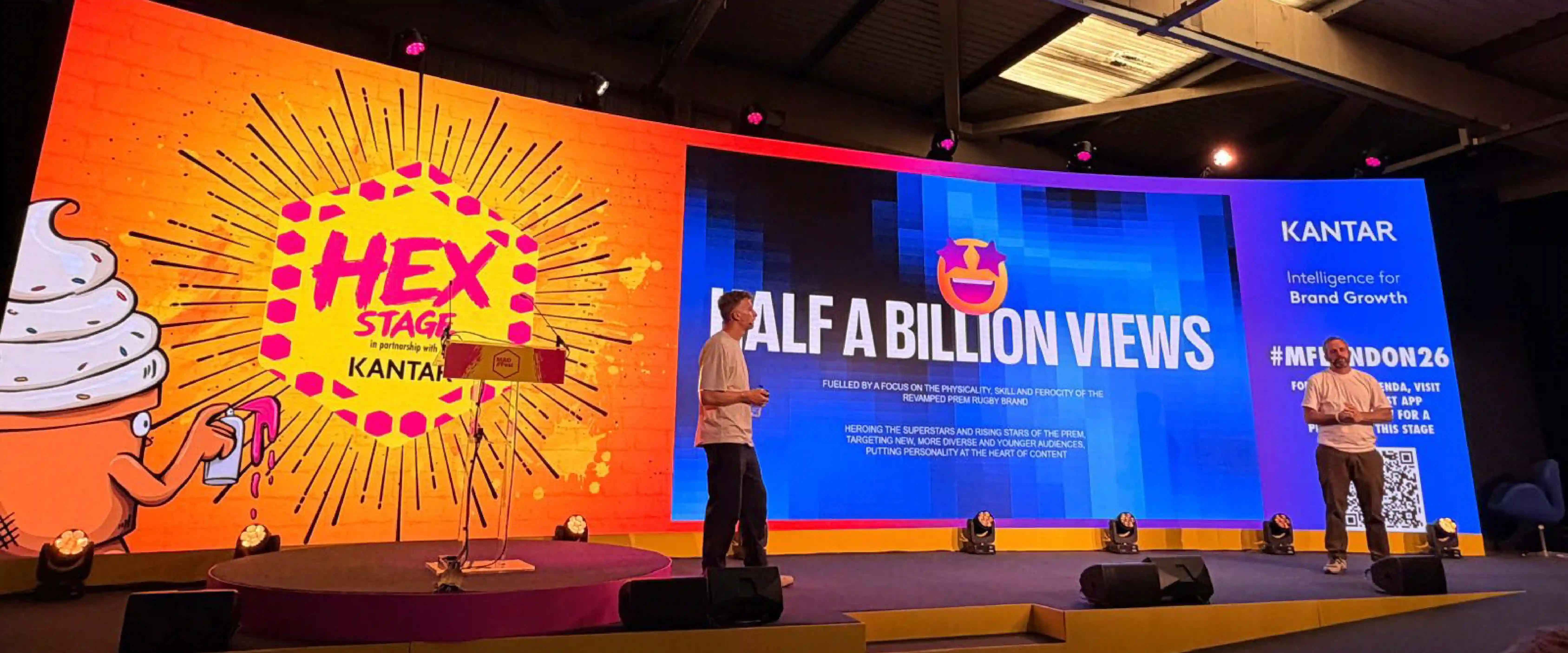
More than 500 million video views.
Social media growth exceeding 90%.
Three consecutive sellout finals.
Growing stadium occupancy.
Broadcaster adoption.
Commercial confidence.
New sponsors.
Greater visibility.
Greater engagement.
Most importantly, a stronger emotional connection with audiences.
The success was not driven by anew logo.
It came from aligning strategy, creativity, content and experience around one coherent idea.
Looking ahead, the ambition continues to expand.
New partners, including Dyson, Red Bull and Defender, are helping support future growth.
The league is investing in a dedicated media operation that will produce documentaries, player-led programming, behind-the-scenes content and entertainment formats designed to engage supporters throughout the year.
The ambition extends well beyond elite competition.
How do more children discover rugby?
How do more girls enter the game?
How do grassroots clubs become stronger?
How do stadiums become fuller?
How do players become household names?
How does the entire rugby ecosystem grow together?
Perhaps the biggest lesson has little to do with rugby itself.
Successful brands do not begin with visual identity.
They begin with perspective.
By asking, "What business are we really in?" instead of "How do we redesign our logo?",the team fundamentally reframed the opportunity.
They stopped thinking of themselves primarily as organisers of rugby fixtures.
They began thinking of themselves as creators of entertainment.
Everything else followed.
The identity.
The content.
The partnerships.
The broadcast.
The storytelling.
The audience growth.
The commercial success.
In the end, the transformation from Premiership Rugby to PREM Rugby was never really about dropping seven letters.
It was about adding something much bigger.
A new mindset.
A new ambition.
A new understanding that in modern sport, the most valuable asset is not simply the game itself.
It is the stories, personalities and emotions that surround it.
When those elements are brought together consistently, truthfully and memorably, a sports league becomes more than a competition.
It becomes a cultural experience.